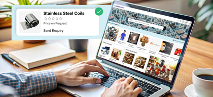
Why User Experience (UX) matters

Ecommerce
197 week ago — 6 min read
Imagine you visit an eCommerce website that sells footwear. At the outset, you find it hard to locate the type of sports shoes you are looking for, as the product categorisation is not clear. You manage to find the product, but then the description and size chart are vague. You are likely to drop off at this stage. If you somehow do go ahead to checkout, and the experience is long-winded, you are likely to abandon your shopping cart.
When you sell online, you can’t just count on your products to sell themselves. You need to provide a good user experience (UX) that makes it easy for people to buy on your website.
As many as 88% of visitors are likely to leave an eCommerce website if they find the design unattractive, checkout experience too long or site navigation confusing. The way people perceive your website is termed as User Experience (UX).
Why UX is vital for your eCommerce website
UX is vital to eCommerce because it ensures that your customers can effortlessly navigate your website, find what they need, and make a purchase, easily. When you make it easy for people to buy from your online store, they’ll buy more often.
The goal of every eCommerce seller is therefore to provide a simple, logical and enjoyable user experience. Good UX improves your website usability, credibility, customer loyalty, and engagement.
7 basic elements for good UX on an eCommerce website
1. Responsive website
Over 54% of eCommerce traffic comes from a smartphone.
So, if your eCommerce website does not offer a mobile-friendly user experience, you need to think about adding one as soon as possible.
A responsive web design ensures that eCommerce customers have a consistent website experience across any device they use while shopping, be it desktop, tablet or mobile.
2. Clean and focused design
Clean design lends a page the breathing room it needs to highlight the call to action for engagement. Focused design helps showcase products (such as with attractive imagery), thereby propelling a customer to buy.
3. Ease of navigation
Navigation is a vital tool that guides users in the right direction and assists in browsing products.
Therefore, the navigation must be prominent, organised and intuitive. Navigation allows users to easily find product categories and sub-categories. The navigation on all pages of the website must be in the same place, style, colours and fonts. You must enable users to shop in different ways such as by brand, colour, new arrivals etc.
Remember, when users can’t find what they want, they won’t buy it.
4. Don’t forget the search bar
Proper site search is very important for an eCommerce business. People who use search boxes are more likely to convert into customers as they are searching with intent. If visitors don’t find the information they are looking for they are likely to leave the website unsatisfied.
For good user experience, put the search bar in an easy-to-find place in the header on all pages.
5. High quality product images and videos
A picture is worth a thousand words. And this is especially true when it comes to eCommerce. Make sure your product pictures are high resolution. Enable a zoom in feature so consumers can closely into the product and see it from different angles or even better offer a 360 degree photo tool, so they can see it from every angle. Showing the context in which products will be used is also very helpful to make the consumer's purchase decision easier. Images should be cropped in a way that they look good on all devices. You can also include compelling product videos and testimonials.
6. Good product descriptions
Product description provides all the information that is needed by a customer. It informs the customer about the important features of the product, why it is useful and how it can be used. A good product description is not only informative, but also raises the interest level of the buyer.
Also read: 7 ways to write product descriptions that sell
7. Easy checkout experience
The checkout or cart page should be the most uncomplicated and user-friendly page of your site. This is the make or break page which decides if a visitor will be converted into a happy customer. This page can have several features that aid a smooth transaction such as clear font, update cart feature, remove and add products functionality, update quantity, auto-fill feature, a simple form to capture address, seamless integration of payment gateway and logistics, multiple payment options and secure transaction assurance.
‘People ignore design that ignores people.’ -- Frank Chimero, Designer
The heart of good user experience is about designing a website that puts the user first.
Do you want to know more about how to optimise User Experience (UX) for your eCommerce website? Recently, I conducted a webinar on User Experience and you can watch the highlights below
To explore business opportunities, link with me by clicking on the 'Connect' button on my eBiz Card.
Image source: shutterstock.com
Disclaimer: The views and opinions expressed in this article are those of the author and do not necessarily reflect the views, official policy, or position of GlobalLinker.
Posted by
Mohammad AdnanContributing to the business growth of SME businesses globally by helping them properly utilize our affordable and easy to use digital commerce solutions.
View Mohammad 's profile
Most read this week
Trending
Ecommerce 5 days ago


Comments
Share this content
Please login or Register to join the discussion